When I first started building CUTTKR, the project list was the most important view. I needed one place where I could see every active edit, what stage it was in, the current version, its deadline, and what needed attention next.
That solved a real problem. But once I started using CUTTKR with more projects, I found another one. A list can tell me what exists, but it does not always show me how the workload is stacking up across time.
I wanted to zoom out and see the whole workload, not keep building the schedule in my head.
A deadline by itself only tells part of the story
When several edits are moving at once, I need to see more than which one is due first. I need to know when each project starts, how long I actually have to work on it, where schedules overlap, and whether too much work is landing in the same part of the week.
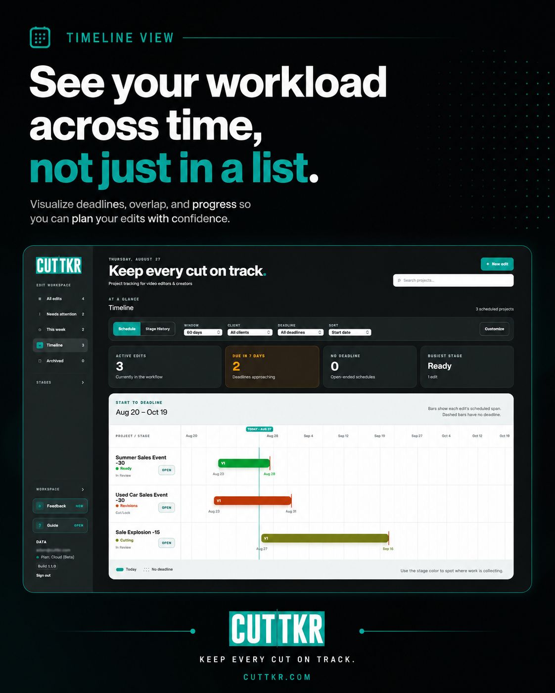
That is why I added the Timeline view. The Schedule tab lays projects out from start date to deadline, so I can see every edit as a span of time instead of another row in a list. Stage colors make it easier to spot where the work currently stands, and projects without deadlines still remain visible instead of disappearing from the plan.
That visual change makes a big difference. Three projects can all look manageable when I read them one at a time. Put them on the same timeline and I may immediately see that two deadlines overlap, another edit has not started, and the week is tighter than it looked.
Stage History answers a different question
The second part of Timeline is Stage History. Instead of showing only the scheduled window, it shows how long an edit has actually spent in planning, cutting, review, revisions, approval, and the other stages in the workflow.
I wanted this because a project can be active for two weeks without being edited for two straight weeks. It may spend a day in Cutting, three days waiting in Review, come back for Revisions, then sit in Approved while final deliverables are being prepared. Looking only at the start date and deadline hides that movement.
Stage History gives me a clearer record of what happened. It can show where a project moved quickly, where it waited, and where the process took more time than expected. I am not using that information to turn every minute into a performance metric. I want better context when I plan the next project and a more honest picture of how editorial work actually moves.
The overview still needs to stay fast
I did not want Timeline to become another screen full of controls that takes longer to understand than the work itself. The view includes filters for client, deadline, stage, active or delivered work, and date range. It also gives me a quick count of active edits, projects due in the next seven days, projects without deadlines, and the stage carrying the most work.
Those details help answer the questions I usually have when things get busy: What is coming up? Where is the overlap? What has been sitting too long? What needs a deadline? Which part of the workflow is getting crowded?
And when I see something that needs attention, I can jump back into that project without leaving the flow to go search for it.
Real work keeps deciding what I build next
This feature came from using CUTTKR on actual editing projects. I did not start with a big product roadmap that told me a timeline had to be there. I started with the project list, used it during a busy season, and kept noticing that I was still trying to picture the schedule in my head.
That has been the pattern with a lot of CUTTKR. The Frame.io feedback alert came from not wanting to open review links just to see whether new comments were waiting. The editorial stages came from needing project status to match the language editors already use. Timeline came from needing to see how all of that work fits together over days and weeks.
I recently shared the Timeline update in a LinkedIn post, and I am still testing it on real projects. CUTTKR is also in private beta, which means other editors are helping me find the parts that work, the parts that are annoying, and the things I have not thought about yet.
The goal is still the same
I am not trying to make editors spend more time managing work. I want the system to carry the project details that usually end up scattered across messages, notes, browser tabs, file names, and memory.
The Timeline view is another way to answer the question behind CUTTKR: Where does everything stand? Now I can see that answer across the entire workload, not just one edit at a time.
You can see more of CUTTKR and join the private-beta waitlist at CUTTKR.com. You can also look through my video editing and motion-design work to see the kind of projects that shaped the app in the first place.